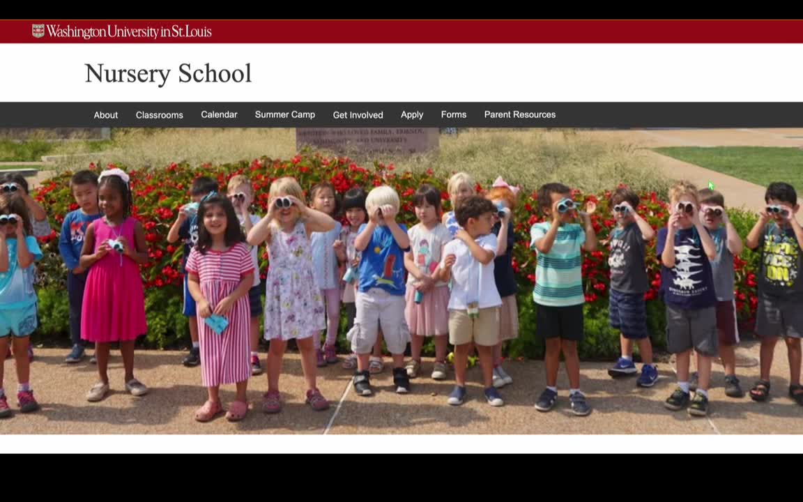
WASHU NURSERY SCHOOL: REBRAND
UI/UX Designer
7 Days
Web Development
Figma
Visual Studio Code
GitHub
Alana Depaz
Annabel Shen
Jane Zhang
Jovonka Johnson
Task Description:
We aimed to enhance the experience of parents and guardians seeking information about the Washington University Nursery School. Using Information Foraging Theory, we studied how users navigate and identify "information scent" to complete specific tasks, such as finding details about curriculum, summer camps, and enrichment programs. The goal was to improve the usability of the nursery school’s website by restructuring content and navigation, enabling visitors to efficiently find information relevant to their needs.
Research and Discovery
- Curriculum Overview:
- Information hidden behind multiple clicks.
- Sparse details about programs, classrooms, and parental involvement.
- Visual hierarchy does not align with natural scanning patterns like F-pattern or Z-pattern.
- Forms and Resources:
- Disorganized layout.
- Confusing structure, making tasks like filling out applications unnecessarily complex.
- Navigation:
- Inconsistent styles (accordion menus, side navigation, hyperlinks).
- Missing or broken functionalities, such as the “Contact Us” button.
We chose to focus on identifying and documenting problems holistically to ensure that proposed solutions wouldn’t create new issues. This approach aligns with Information Foraging Theory, which emphasizes understanding user behavior in seeking and consuming information.
We also applied Information Foraging Theory principles to diagnose issues in the original WashU nursery school site:
- Low Information Scent:
- Users were unsure where to click for critical information due to unclear cues.
- The curriculum page had minimal content, leaving users with “low enrichment.”
- Suboptimal Patch Layout:
- Content was scattered across pages in a manner that disrupted natural navigation patterns.
- Missed Opportunities for Sequential Organization:
- The enrollment process lacked a clear, step-by-step structure, leading to user confusion.
- Inconsistent Matrix Organization:
- Information like class schedules and events could benefit from a grid or matrix layout to present multiple related details more efficiently.
- Clear navigation with a consistent structure.
- Thoughtfully placed visuals to break up text and improve engagement.
- Sequential organization of enrollment steps, reducing user friction.


01 Information Architecture and Prototype
- Simplified Curriculum Overview: Rather than relying on a PDF, we presented the curriculum details directly on the page in a bullet-point format, making it easier for users to skim the content.
- Visible Summer Camp Button: A clear call-to-action button labeled "Summer Camp Information" was placed prominently on the homepage and linked to a dedicated Summer Camp page.
- Improved Navigation: Dropdown menus were redesigned to make them more intuitive, with clear arrows to indicate additional content.


02 Key Designs and My Role
Curriculum Overview Page Redesign
- Task: Simplified the Curriculum Overview page by extracting essential information from a lengthy PDF and displaying it in an easy-to-read, bullet-point format.
- Role: Responsible for restructuring the content, ensuring it was concise and aligned with Information Foraging Theory principles. I also designed the visual hierarchy to make the information more skimmable, reducing cognitive load.


Summer Camp Information Section
- Task: Addressed user struggles in locating the Summer Camp page by making it more visible and intuitive.
- Role: I proposed and implemented a dedicated Summer Camp section on the homepage with a clear call-to-action button. I ensured the button matched the rest of the site's design and incorporated hover states for better interaction. Additionally, I added a brief overview to provide users context before navigating to the Summer Camp page.

Navigation Enhancements
- Task: Improved the visibility and accessibility of dropdown menus, especially within the Classroom and Enrichment tabs.
- Role: I contributed to refining the dropdown behavior by adding clear visual cues (such as arrows) to indicate more content. I also suggested renaming tabs and restructuring content to ensure users could quickly identify and locate relevant information.

Sitewide CSS Modifications
- Task: Refined the overall visual and functional design of various pages on the site, including the index page, classroom details, and footer.
- Role: I focused on creating a visually appealing and easy-to-navigate layout by adjusting spacing, hierarchy, and font sizes using CSS. I worked on styling the sticky navbar to ensure quick access to key areas, such as the "Apply Now" button.


03 User Research and Testing
Findings from Initial Testing
- Curriculum Overview: Users struggled to locate detailed information about the curriculum, as it was buried within a linked PDF.
- Summer Camp Information: Despite the Summer Camp information being present in the header, users had difficulty finding it within 2 minutes.
- Navigation Confusion: Users were confused by the inconsistent navigation patterns across different pages (e.g., accordion menus, side navs, hyperlinks).
Iteration Based on User Feedback
- For the Curriculum Overview, we removed the PDF and presented the content directly on the page in a streamlined bullet-point format for quicker readability.
- For the Summer Camp page, we made the section more prominent on the homepage by adding a red section with a clear button labeled "Summer Camp Information" and an overview of the content on the page. This helped users find the information faster.
- We enhanced the dropdown menus for sections like "Classrooms" and "Enrichment" by adding arrows to indicate more content, making the navigation clearer.
CONCLUSION
Final Design Solution
Takeaways
Improved Usability: Users were able to find the most critical information, such as the curriculum and summer camp details, more quickly and efficiently.
Enhanced User Satisfaction: Feedback from user testing indicated that the changes made the site easier to navigate and more user-friendly.
Increased Efficiency: By reducing the need to click through multiple links and PDFs, users were able to access the information they needed in a more streamlined manner.

